Exploring the World of Designer Wall Art
When it comes to decorating our home interiors and living spaces, we often turn to art for that perfect finishing touch. Art has the incredible power to transform a room, imbuing it with character, emotion, and a unique aesthetic appeal. While traditional art has always been a classic choice, a new approach has been emerging in the world of interior design – Designer Wall Art.
In this comprehensive guide, we will embark on a journey to explore the world of Designer Wall Art, delving into its significance and how it distinguishes itself from traditional art forms. Whether you're a seasoned art enthusiast or someone just beginning to dip their toes into the artistic waters, this guide will help you gain a deeper understanding of this exciting and evolving niche.
The Essence of Designer Wall Art
Designer Wall Art is not just about a pretty picture or a well-crafted sculpture; it's about taking a step beyond traditional boundaries to create art that is not just appealing but also coherent and meaningful within the interior. It's about art that reflects not only the artist's original vision, but which is also a reflection of the essence of the space it inhabits - and the people who experience it.
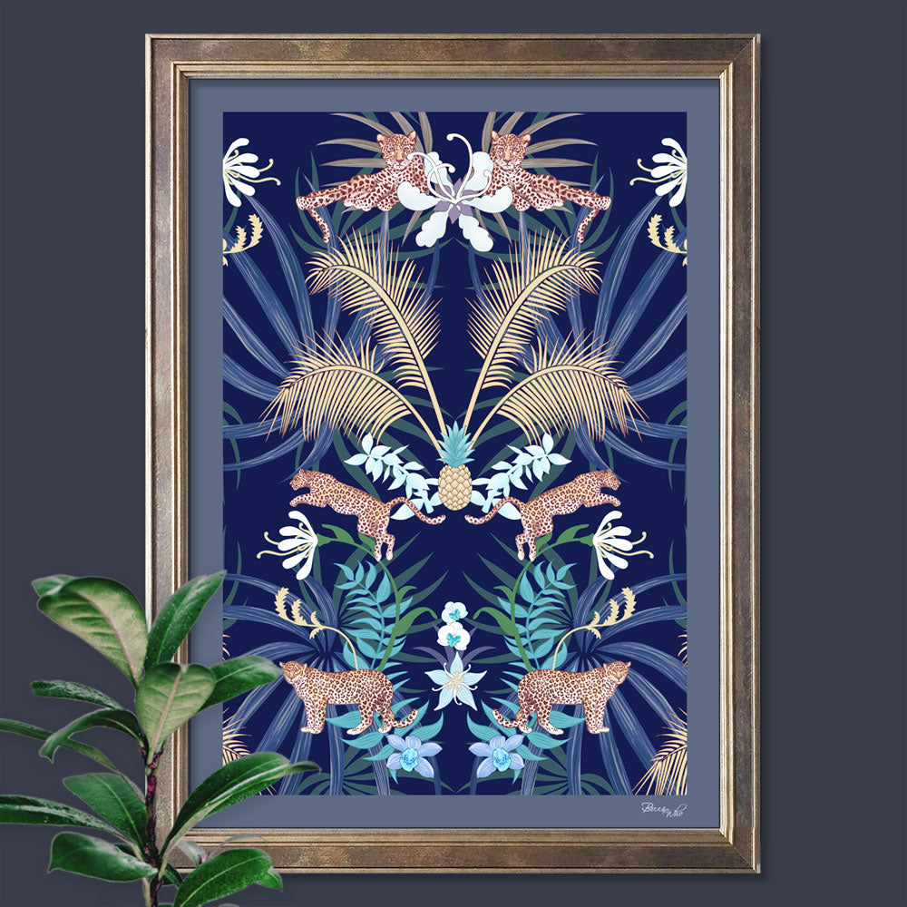
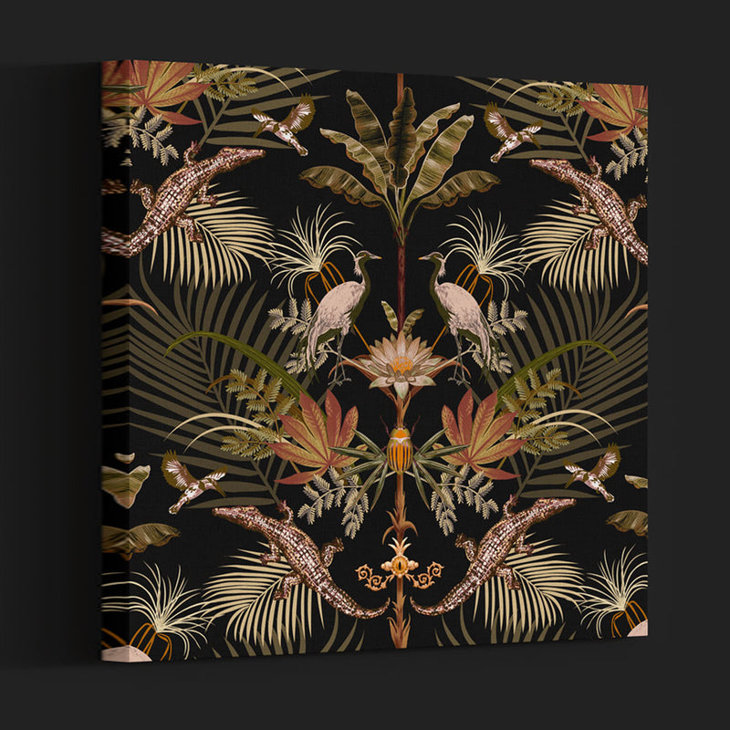
Choosing Designer Wall Art to Compliment Interior Design
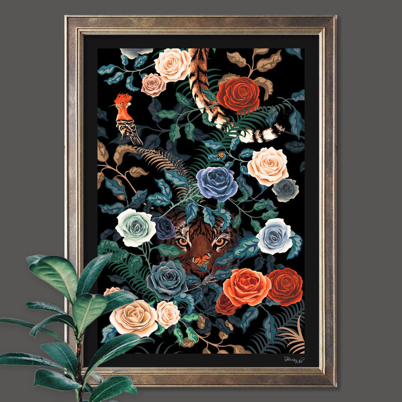
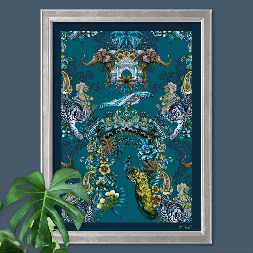
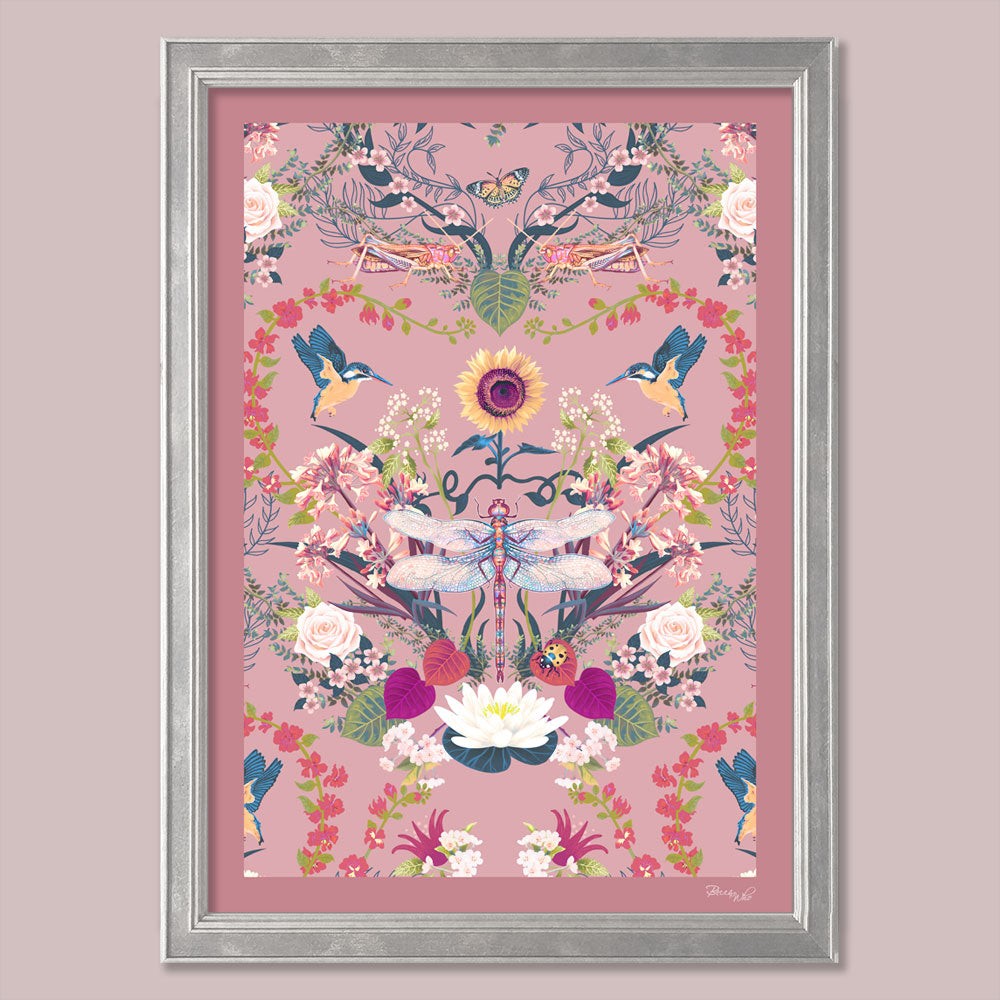
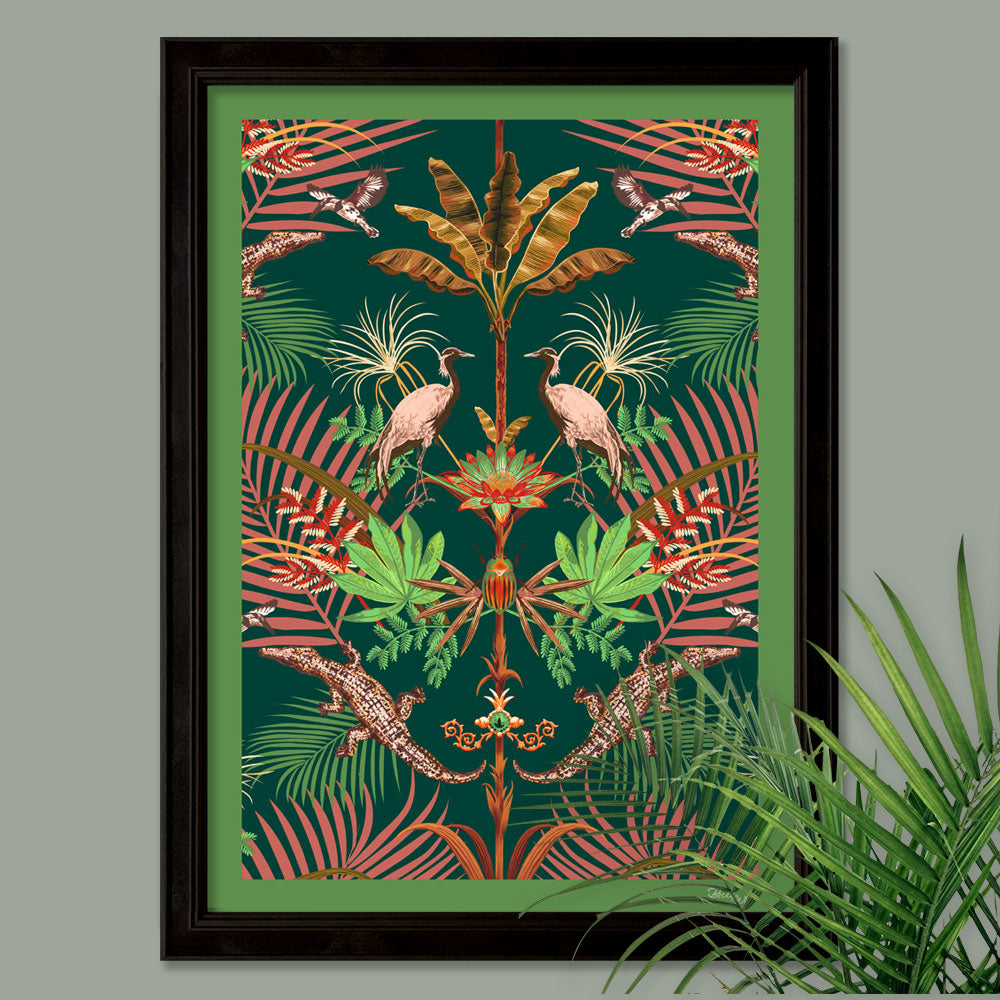
One of the primary distinctions of Designer Wall Art lies in its uniqueness. Unlike traditional art, which can be found in galleries and museums, Designer Wall Art is often created with a specific space or type of space in mind. It is carefully crafted to fit seamlessly within a room, creating a harmonious dialogue with its surroundings.
Designer Wall Art can be seen as an extension of interior design. It blurs the line between functional decor and artistic expression. Each piece is carefully chosen or created to evoke a particular mood, convey a theme, or tell a story. This makes it a powerful tool for interior designers and home owners alike to shape and enhance the ambience of a room.
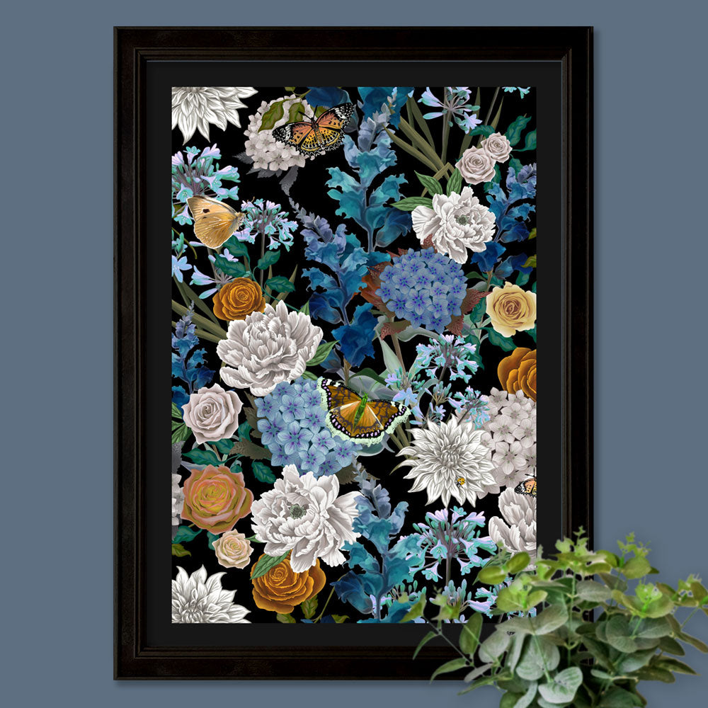
Designer Wall Art is not limited to any specific medium or technique. In fact, this genre often celebrates diversity and experimentation. From paintings and sculptures to mixed media, textiles, and even digital art, the possibilities are endless. Designers and artists frequently blend various mediums to achieve their desired results, which opens up a world of creativity.
How Designer Wall Art Differs from Traditional Art
Now that we've explored the essence and significance of Designer Wall Art, let's take a closer look at how it differs from traditional art.
1. Purpose: While traditional art is primarily created for artistic expression and appreciation, Designer Wall Art is driven by a purpose. It's intended to serve as an integral part of a room's decor, complementing the space and its intended use.
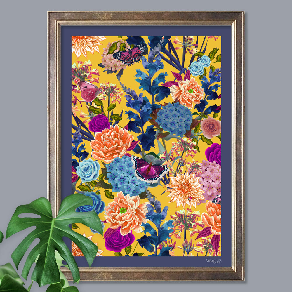
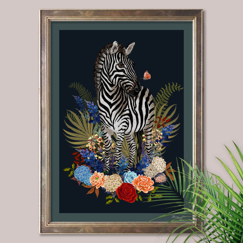
2. Creative Approach: Designer Wall Art is conceived to align with the colour scheme, theme, and mood of a room, making it a perfect fit for the space. This is where a design across Fabric and Wallpaper, can be perfectly complemented by the accompanying Wall Art of the coordinating design. Designer Wall Art often serves to highlight a particular colour from a Fabric or Wallpaper design, which is felt to be a strong candidate for an accent hue within a space.
3. Integration with Design: Traditional art is typically added to a room after the design is complete. Designer Wall Art, on the other hand, is often incorporated into the design process from the very beginning, allowing it to become an essential part of the overall aesthetics.
4. Interactivity: Designer Wall Art has the potential to be interactive. It can engage viewers on a personal level, encouraging them to explore the art and its relationship with the space. It encourages people into appreciating the coordinating Fabric and Wallpaper as artistic elements themselves within the space.
Designer Wall Art is a living, breathing part of a room's narrative. As you continue on this artistic journey, you'll discover how Designer Wall Art can enhance and transform spaces. Whether you're an interior designer seeking to create a coherent, immersive experience or a home owner yearning to make a personal statement, Designer Wall Art offers endless possibilities to express your vision.
Colour Psychology in Wall Art
Understanding the psychology of colour in wall art is a captivating journey that goes far beyond the visual appeal. The colours we choose to adorn our walls with can have a profound impact on our emotions, moods, and even our well being. Whether you're decorating a home, office, or any other space, the hues you select for your wall art can send powerful messages about your personality, preferences, and the atmosphere you want to create.
The choice of colour is a reflection of your inner world, and it holds the potential to set the tone for a room. Each colour has its unique psychological associations, and it's essential to harness this knowledge to create a space that resonates with your intended feelings and message.
Let's delve into the world of colour psychology and explore how different colours can influence our emotions and spaces. We'll discuss how to choose the right colours for your wall art to evoke the desired mood, whether it's serenity, energy, creativity, or any other emotion you wish to cultivate in your environment.
Understanding the cultural and historical significance of colours allows us to harness their emotional power effectively. It enables us to create spaces that resonate with our intentions and personalities; Whether you're seeking a peaceful retreat, an inspiring workspace, or a vibrant social hub, understanding the psychology of colour will be your guide to achieving the atmosphere you desire.
The Impact of Different Colours in Interiors
1. Red: This bold and intense colour is associated with passion, energy, and excitement. Red wall art can evoke strong emotions and stimulate the senses. Throughout history, red has symbolized love, power, and sometimes even danger. From the vibrant red hues used in traditional Chinese weddings to the red carpet of fame and fortune in Hollywood, this colour's cultural significance is rich and diverse. In wall art, red can infuse spaces with vitality, making it an excellent choice for areas where you want to create a dynamic and lively atmosphere, like dining rooms or entertainment areas.
2. Blue: Blue is often linked to serenity and calm. It has the power to reduce stress and promote a sense of peace and relaxation. Historically, blue has been associated with the divine, conveying a sense of trust and tranquility. From the blue of the Egyptian sky god, Horus, to the serene blues of Mediterranean landscapes, this colour has a broad cultural significance. In wall art, blue can evoke feelings of peace and relaxation, making it a perfect choice for bedrooms or spaces intended for rest and reflection.
3. Yellow: Yellow is a colour of optimism, happiness, and creativity. This cheerful colour has been used throughout history to convey the joy of sunshine and enlightenment. Yellow is a versatile hue which can bring warmth and positivity to a room. Yellow wall art can work wonders in areas where you seek to encourage creativity and innovation, such as home offices or studios.
4. Green: Green is often associated with nature, growth, and renewal. It is a versatile colour that can create a sense of balance and harmony. The cultural significance spans from the lush green landscapes of Ireland to the calming green spaces of Japanese gardens. Green wall art is ideal for spaces where you want to promote a sense of well being, such as living rooms or bedrooms.
5. Purple: Purple is a colour of luxury, creativity, and spirituality. This regal colour has been used historically to signify power and extravagance. It can add a touch of opulence and mystique to your space. Purple wall art is a great choice for areas where you want to create a sense of richness and sophistication, like lounges or dressing rooms.
6. Orange: Orange is a vibrant and energetic colour that can add a sense of enthusiasm and joy to a room. Throughout history, it has been used in religious ceremonies and celebrations. It's also comforting, bringing a sense of warmth and connection. Ideal for spaces where you want to infuse some vitality, or a sense of comfort and positivity – a good choice to include in the heart of the home, a space for relaxation or entertainment such as dining and kitchen areas.
How To Choose the Right Colours For A Space?
When selecting colours for your wall art, it's important to consider the function of the space and the emotions you wish to evoke. You can also mix and match colours strategically to create a well balanced atmosphere. For example, combining blue and green in a bedroom can promote relaxation and a connection to nature, while adding touches of purple and blue to a dining space can create an atmosphere in which to unwind, with a sense of indulgence and luxury.
Moreover, it's crucial to consider the lighting in your space, as it can affect how colours appear. Natural light can make colours appear brighter and truer, while artificial lighting can influence the perceived tone of the colour.
If your home has an open floor plan or rooms that flow into one another, it's important to ensure a sense of continuity. Choose an accent colour or colour scheme that works harmoniously throughout the connected spaces, so your interior feels cohesive.
Remember that the key to a successful interior design is not only choosing the right accent colours but also maintaining a sense of balance and harmony. Your space should reflect your personality and preferences while ensuring a visually pleasing and comfortable environment. With these guidelines in mind, you're well on your way to selecting the perfect accent colours for your interior.

Colour Coordination and Techniques for Selecting Wall Art Colours
Selecting colours for wall art is not just about personal preference; it's a science and an art. Here are some practical tips on how to coordinate colours effectively and techniques to ensure your chosen colours harmonise with the overall design of your space:
1. Colour Harmonisation:
Start by choosing a colour palette that complements the existing colours in your space. If your room features neutral tones, adding a pop of a bold accent colour can create a striking contrast. Alternatively, if your space is already vibrant, consider selecting wall art colours that harmonize with the dominant hues.
2. Colour Temperature:
Consider the temperature of colours. Warm colours like reds, oranges, and yellows evoke energy and coziness, while cool colours like blues and greens promote calm and freshness. Combining warm and cool colours can create a balanced and visually appealing atmosphere.
3. Complementary Colours:
For a bold and eye-catching effect, explore complementary colour schemes. These are colours located opposite each other on the colour wheel, such as red and green or blue and orange. Pairing complementary colours can create dynamic visual contrast.
4. Analogous Colours:
Analogous colours are those that are adjacent to each other on the colour wheel, like blue, green, and teal. This scheme creates a harmonious and calming effect, making it suitable for spaces where relaxation is a priority.
5. Monochromatic Scheme:
If you prefer a more minimalistic look, opt for a monochromatic colour scheme. This involves using different shades and tints of a single colour. It creates a sense of unity and simplicity, allowing the subtleties of the colour to shine.
6. Accent Walls:
Consider using an accent wall to showcase your chosen accent colour. An accent wall is a single wall painted or adorned with a distinctive colour or pattern, drawing attention to that particular area and adding depth to the room.
7. Nature Inspired Palettes:
Nature often provides an abundance of colour inspiration. Think about the colours found in your surroundings, such as the blue of the sky, the green of leaves, or the earthy browns and tans of the landscape. Nature inspired colour palettes can create a sense of connection to the outdoors and promote a calming atmosphere.
8. Test Swatches:
Always test colour swatches for wallpaper and paint decor before committing to a final choice. Apply a small amount of paint or consider trying wallpaper samples taped up on the wall. Observe how the colour looks in different lighting conditions throughout the day and how it interacts with other elements in your space.
9. Consider Wall Art Size:
The size of your wall art can also impact the overall colour effect in your space. Large pieces can dominate the room and may require more careful colour selection to ensure harmony. Smaller pieces can be a source of concentrated colour impact without overwhelming the space.
By carefully considering colour coordination and these techniques, you can ensure that your chosen colours for your wall art work harmoniously within your space, creating the desired emotional impact and aesthetics.
Now that you have a deeper understanding of the psychology of colour in wall art and how to effectively choose and coordinate colours, you're well equipped to embark on your journey to transform your living and working environments into vibrant canvases that reflect your unique style and evoke the desired emotions. Whether you're an art enthusiast, an interior design aficionado, or simply someone looking to enhance their space, the world of colour psychology in wall art offers endless possibilities for personal expression and creative design.
0 comments